Shaping Symbols – Constructing Logos with Apps
![]()
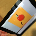
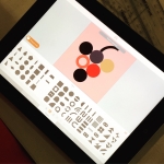
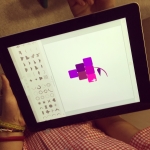
It was visual literacy in action this week at The Kellett School in Hong Kong as a variety of elementary classes explored logo design for packaging. These young learners needed to craft a distinctive design, using a considered colour palette and a combination of shapes, in Assembly app on their iPads.
While there are a whole variety of tools that can be used for this kind of task, one of the powerful tools in this app is actually one that is missing – text! With no words ‘to do the talking’, the principles of art and design took centre stage during the production of this purely visual piece of communication.

Learning Objectives
During this task, students were presented with an opportunity to;
Grapple with a background layer/shape and the resulting cohesion of the design,
Explore the importance of size and scale to individual visual elements,
Investigate viewer recognition, individual interpretation, and the embedded power of signs and symbols,
Select colours to create mood and communicate meaning, etc.
One of the most exciting aspects of this app for the classroom is the ability for users to playback and save a video of their creative time. Students can see all their design work come to life, exploring their decision-making and reflecting on the outcome. It’s an engaging way to share their journey and makes their thinking more visible. Watching these clips also highlights the iterative nature of this kind of work, providing a great context for those discussions about trial and error, the creative process, etc.
From the Students…
“I never really thought about the logos all around me and what they were saying. I just saw them, I guess. Now I can’t stop thinking about what they are telling me. And thinking about how they are communicating that stuff with pictures and colours and shapes is really interesting.”
“I put a triangle in behind my logo to mirror the tree shape. And then it kind of knitted together. It was a collection of shapes until it did that, and then it became more solid like a logo.”
“I had lots of colours, and it looked pretty good, but when I changed them all to just shades in the same colour the message was much clearer. You looked at the logo and you just instantly knew what the story was, you didn’t have to go looking for it anymore.”
“It’s actually really hard to do something simple. Good and simple at the same time is actually complicated.”
Resources For Our Youngest Students

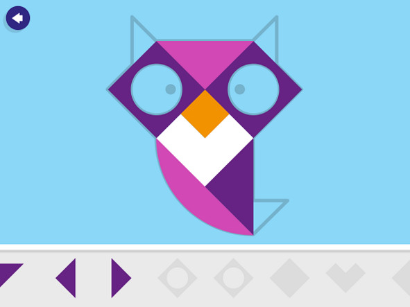
Obviously the Assembly app is a very powerful tool for a whole variety of graphic design and art-making contexts. For our really young learners, Tayasui Tangram app is another option with a simplified interface. Students can work through puzzles that allow them to build with shapes, and then they can extend this understanding to produce their own creations using a combination of geometric designs.
